SK IT Solutions
Project Overview
SK IT Solutions, a technology company, needed a professional identity that could communicate both technical expertise and corporate reliability. Their request was twofold: a visual brand identity that establishes recognition and a company profile that positions them credibly in front of clients and partners. The goal was to create a brand that feels morn, trustworthy, and aligned with the IT industry.
Design Process
We analyzed the IT sector’s visual language, identifying what conveys innovation and trust.
Several design directions were explored, ranging from sleek and futuristic to grounded and corporate, until the right balance was achieved.
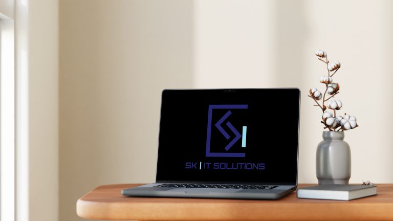
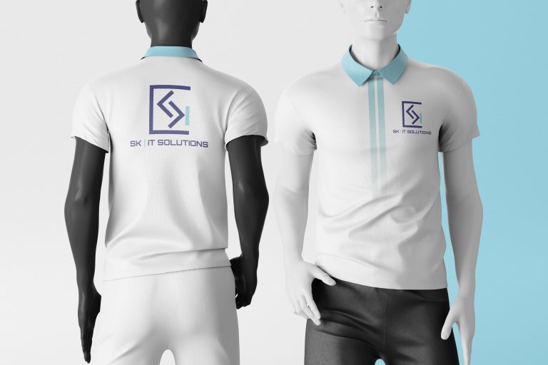
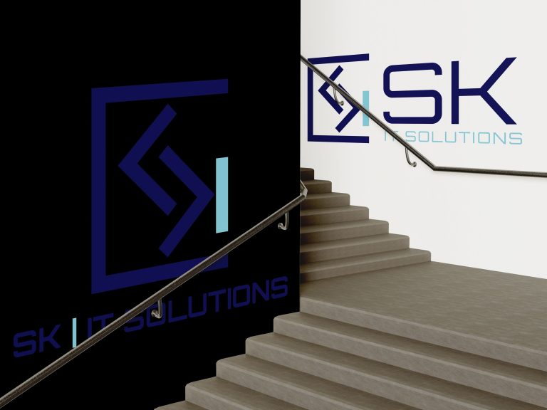
The final identity combined sharp typography, a tech-inspired color palette, and a logo that signals precision and adaptability. The company profile was crafted to highlight SK IT Solutions’ services, values, and differentiators in a clear, client-acing format.
The brand package was handed over with guidelines, ensuring consistency across digital and print applications.
The Challenge
The challenge was to design an identity that felt distinctly IT-focused without blending into the generic aesthetics of the industry. Too abstract, and the brand risked losing clarity; too conventional, and it would fail to stand out. We needed a system that was both professional and memorable.
The Impact
The new brand identity and company profile gave SK IT Solutions a strong foundation for growth. Their logo and visual system now communicate credibility and innovation, while the profile provides a polished tool for client engagement. Together, these assets position SK IT Solutions as a forward-looking partner in the technology space.