Cold Ice
Project Overview
Cold Ice specializes in dry ice solutions, from industrial cleaning to specialized applications. They needed a brand identity that could speak directly to high-value clients such as hospitals and large corporates. The brief was clear: design a logo, build a visual identity system, and create a company profile that communicates professionalism, innovation, and trust.
Design Process
We studied the dry ice industry and the expectations of corporate buyers to understand what would resonate.
Several identity directions were explored, some leaning into scientific clarity, others into industrial strength, until we found the right balance.
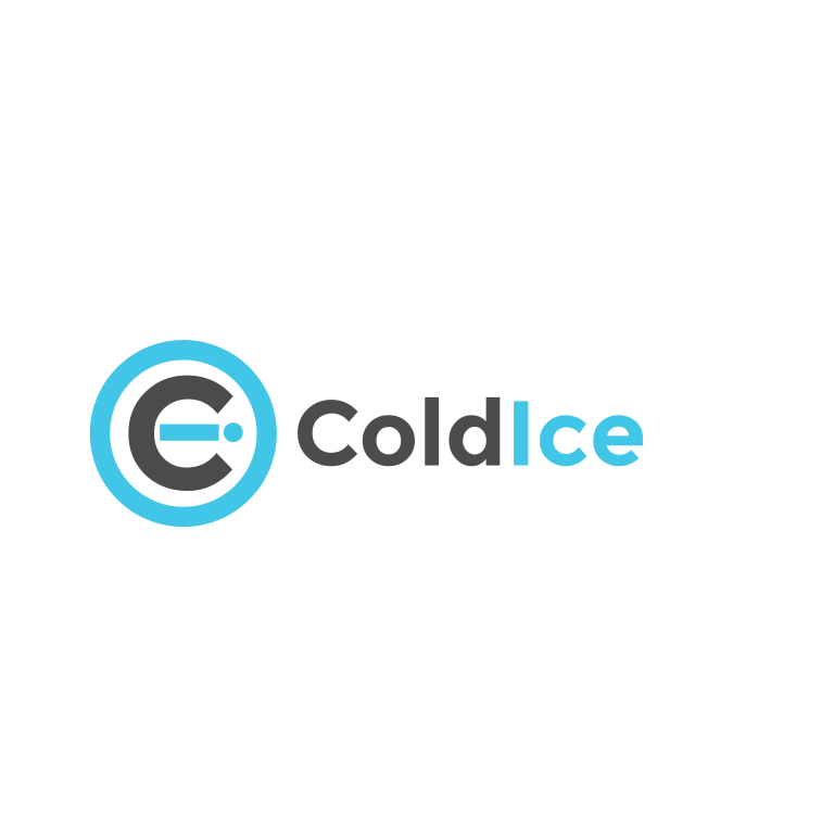
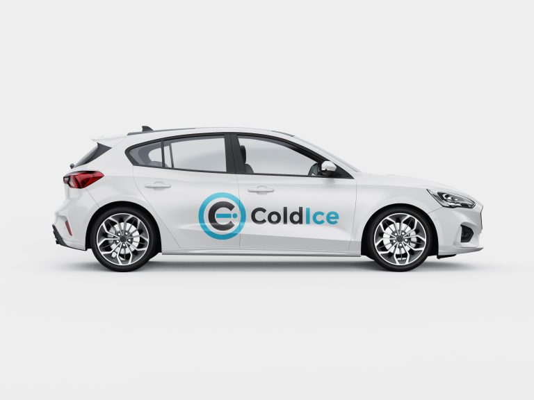
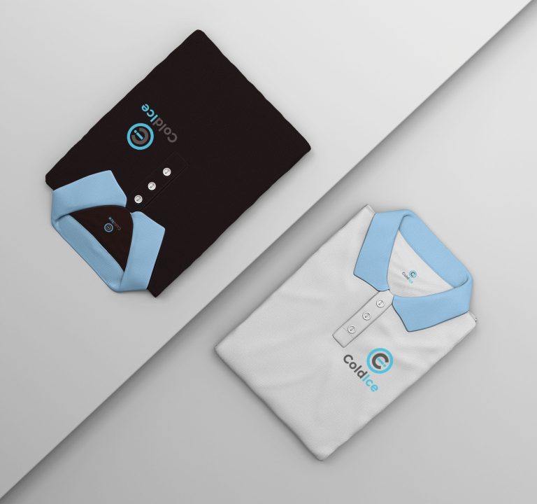
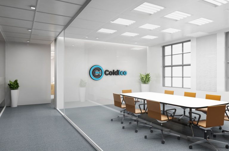
The final logo was designed to feel sharp and modern, supported by a cool-toned palette and clean typography. The company profile was crafted as a polished, client-facing document that showcases Cold Ice’s capabilities with clarity and authority.
The challenge was positioning Cold Ice as both approachable and highly professional. Hospitals and corporates demand trust and reliability, so the brand needed to feel credible without being sterile. Too industrial, and the identity risked feeling cold and impersonal; too playful, and it would undermine authority. We had to design a system that balanced innovation with gravitas.
The Challenge
The challenge was integrating two distinct objectives: showcasing projects and educating audiences, without overwhelming visitors. The risk was creating a site that felt fragmented or unfocused. We needed to design a seamless experience where the portfolio and blog complemented each other, reinforcing the brand’s authority and accessibility.
The Impact
The new identity gave Cold Ice the confidence to approach major clients with a brand that reflects their expertise. Their logo and company profile now communicate professionalism and innovation, while the visual identity ensures they stand out in a niche industry. The brand positions Cold Ice as a trusted partner for large-scale projects, opening doors to new opportunities.